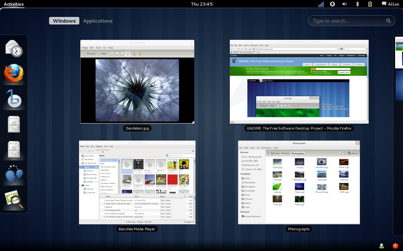
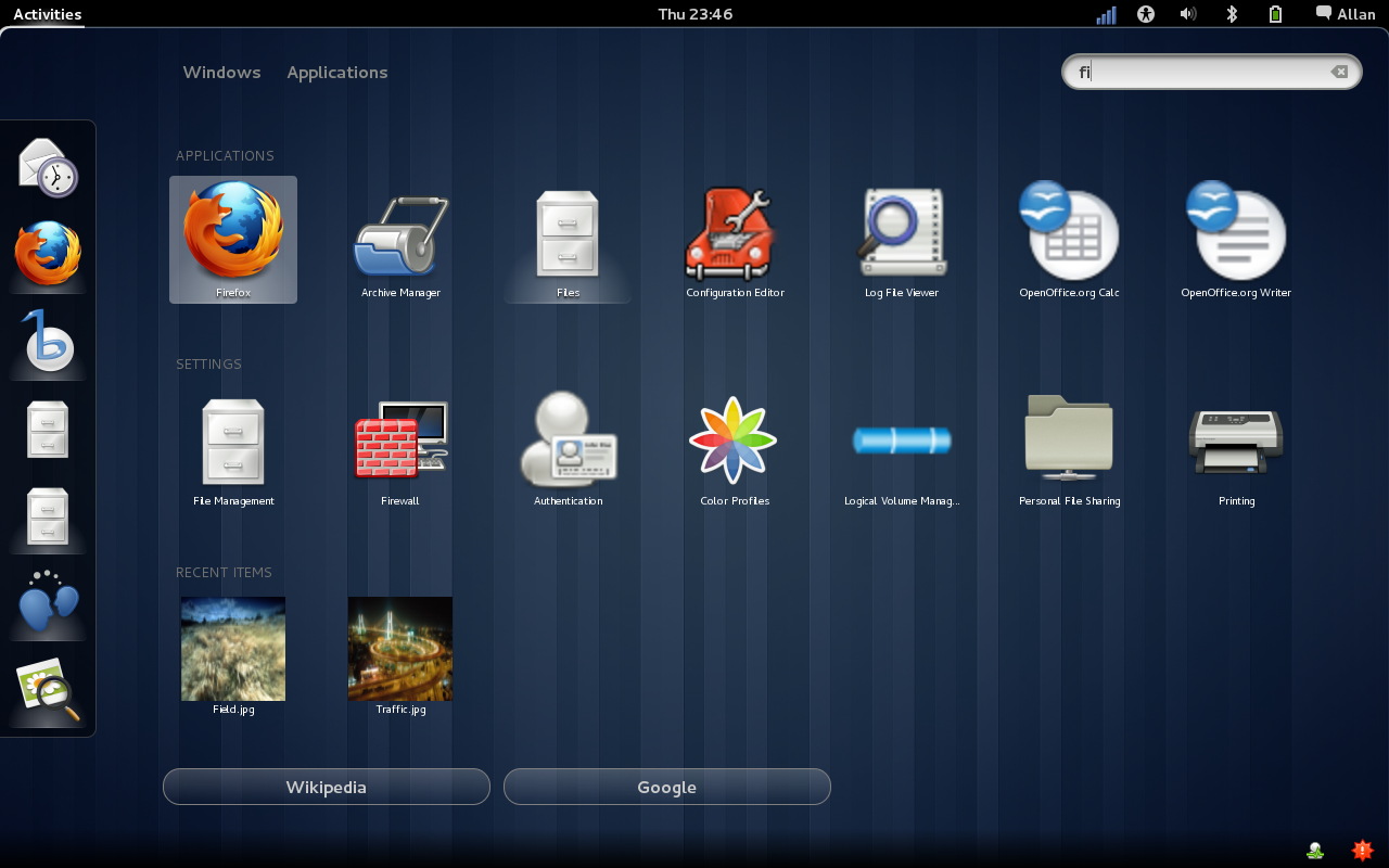
While you are waiting for the Gnome 3 impatiently for the April 2011 release, you could attempt peaking at new shell. Those who have had a go at it come away excited at the substantial changes. The desktop design is spanking new and definitely appealing. New intuitive messaging, without have to switch, that allows you to reply are some of the distinctive and immediately identifiable changes. GNOME3 is essentially the next generation shell and several legacies of the GNOME 2 have disappeared because there is no room for them in the new shell design.
3 Features that are slashed
There is uproar about three simple design features that gnome-users are fond of that have disappeared, while some are in transition phase. Three issues – lack of dock/window lists; lack of applets, widgets and theming/customization limitations. Gnome 3 is powered to offer full customization in future with powerful extension system and the present limitation is only until the gestation period for Gnome 3 is completed. Applets are the core of Gnome 3 functions and therefore additional provision for widgets, framework is not available presently. However, Gnome 3 is open to provisioning them in the future if there is a drive for it. That leads to the most important feature- absence of mini
What happened to maximize buttons?
The maximize button is lost to the drag-to-snap motion as by default dragging causes one half of the screen to open. The windows are now easy to resize by dragging the title bar. This means dragging is the way forward for all kinds of resizing or snapping operations and this ensure operational consistency as well as being predictable. One eventually accepts that resizing is the future because most desktop operations are highly touch sensitive and early adaptation has its advantages.
How about minimize buttons
Most who are comfortable on the gnome 2 are going to miss the minimize button for the better. Retaining them would have surely ruined the design of the new shell. Since there is no list, dock that exists always on the desktop, there is nothing the minimize buttons can be placed on. If the minimize buttons were to be hidden, the question is where to hide it as there is only the overview in the new desktop design now.
The design element introduced to replace minimization is workspaces and the activities overview. This feature will take some time to adjust to but is truly effective as there is simply no clutter with organized workspaces.
Better capabilities sans buttons
What the loss of the buttons gives Gnome3 is a powerful yet simple user interface that quickly makes up the loss of any redundant buttons. The touch friendly title bar buttons are easy to use keeping to window control on the right enabling the windows to be read from the centre, vertically. The two buttons are traded for excellent user-friendly features. The User Interface is consistent in quality and there is definitely much expectation from this feature. It is very clear that it is only the buttons that have been removed and not the maximizing or minimizing feature.
* Screenhots : Gnome3 website
{module user9-footer|none}


